Stone Road Farms
The Brief
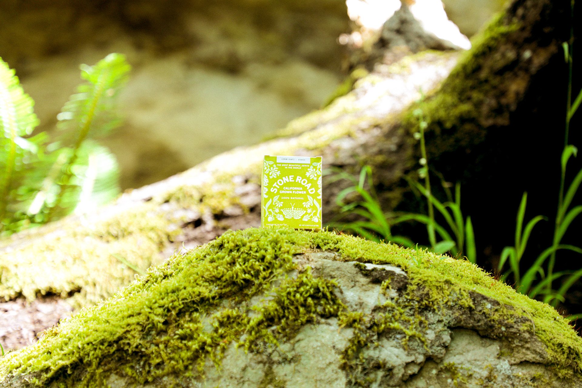
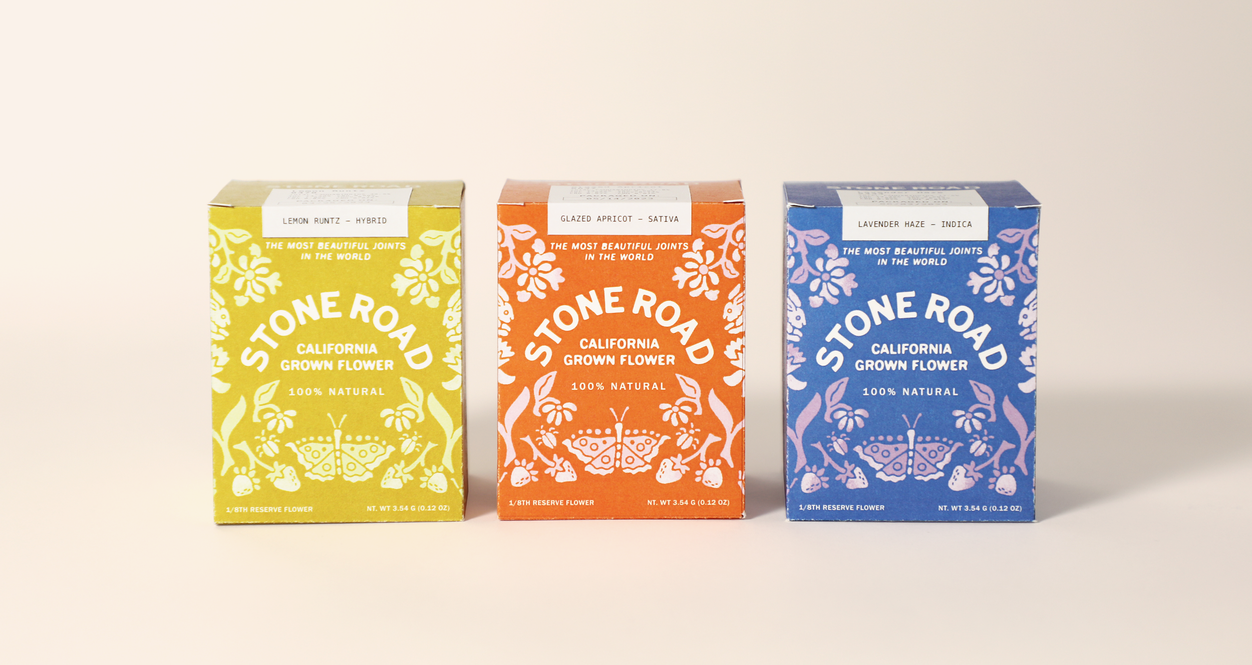
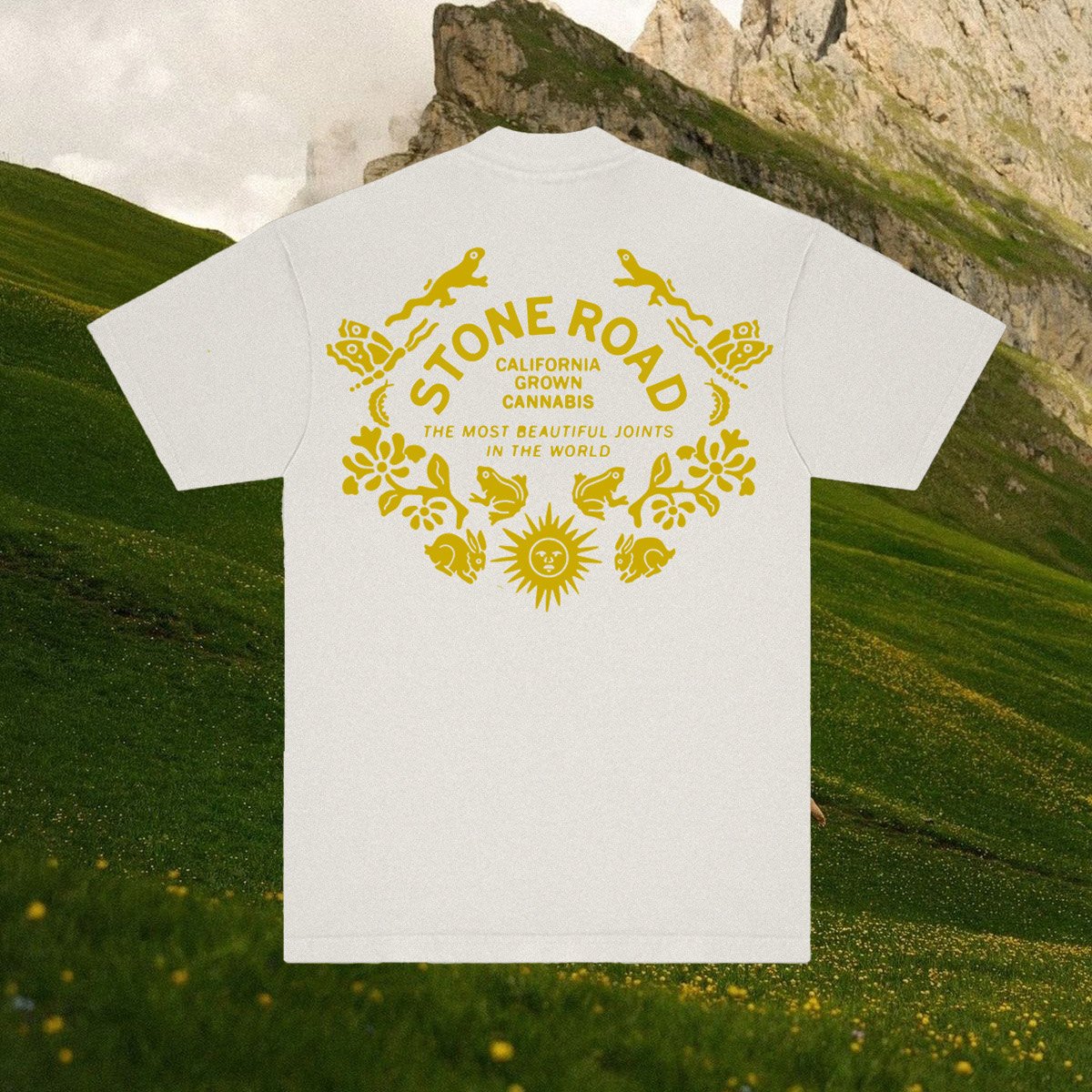
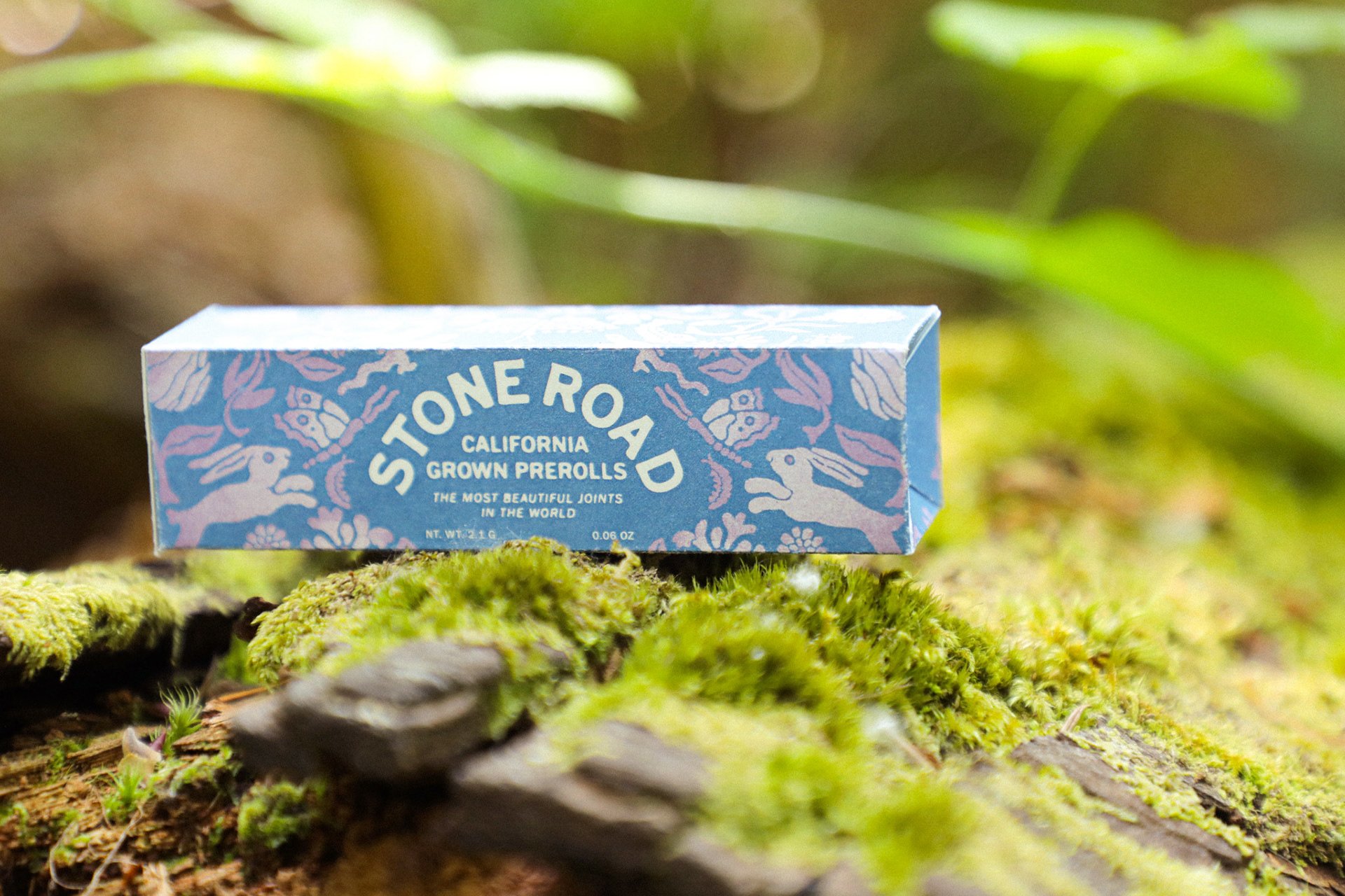
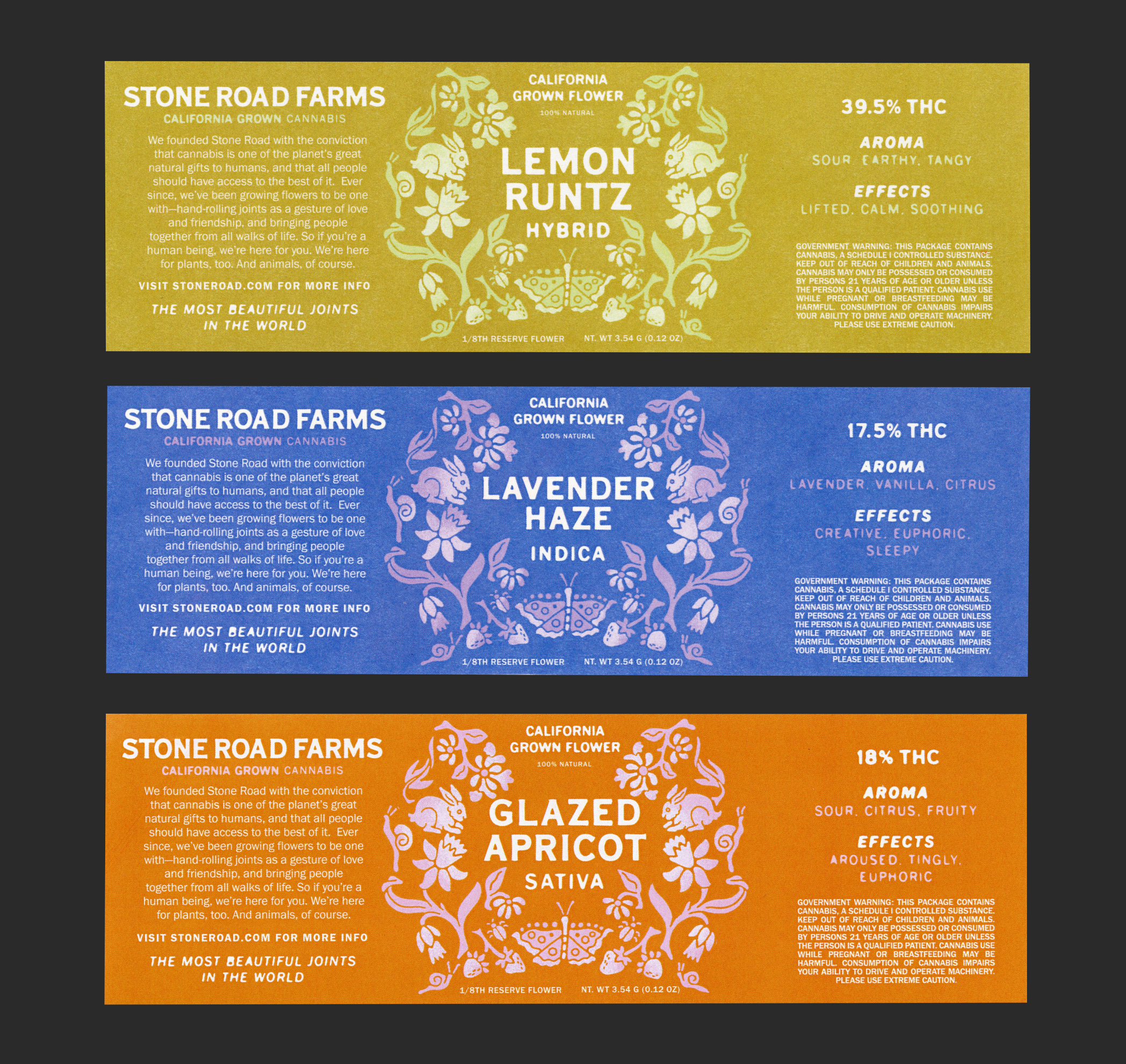
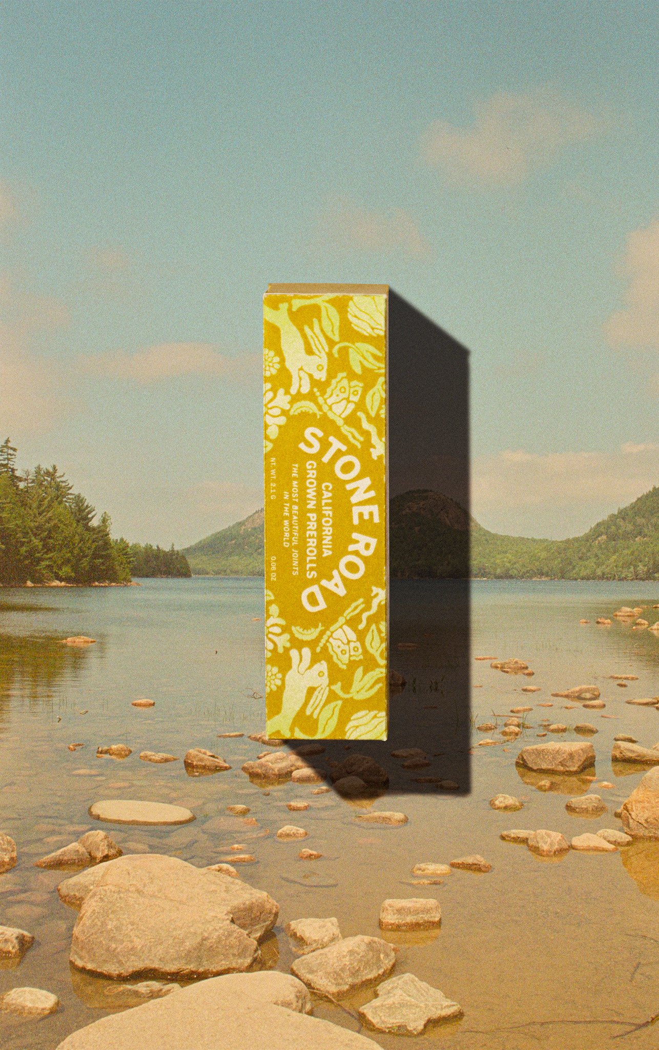
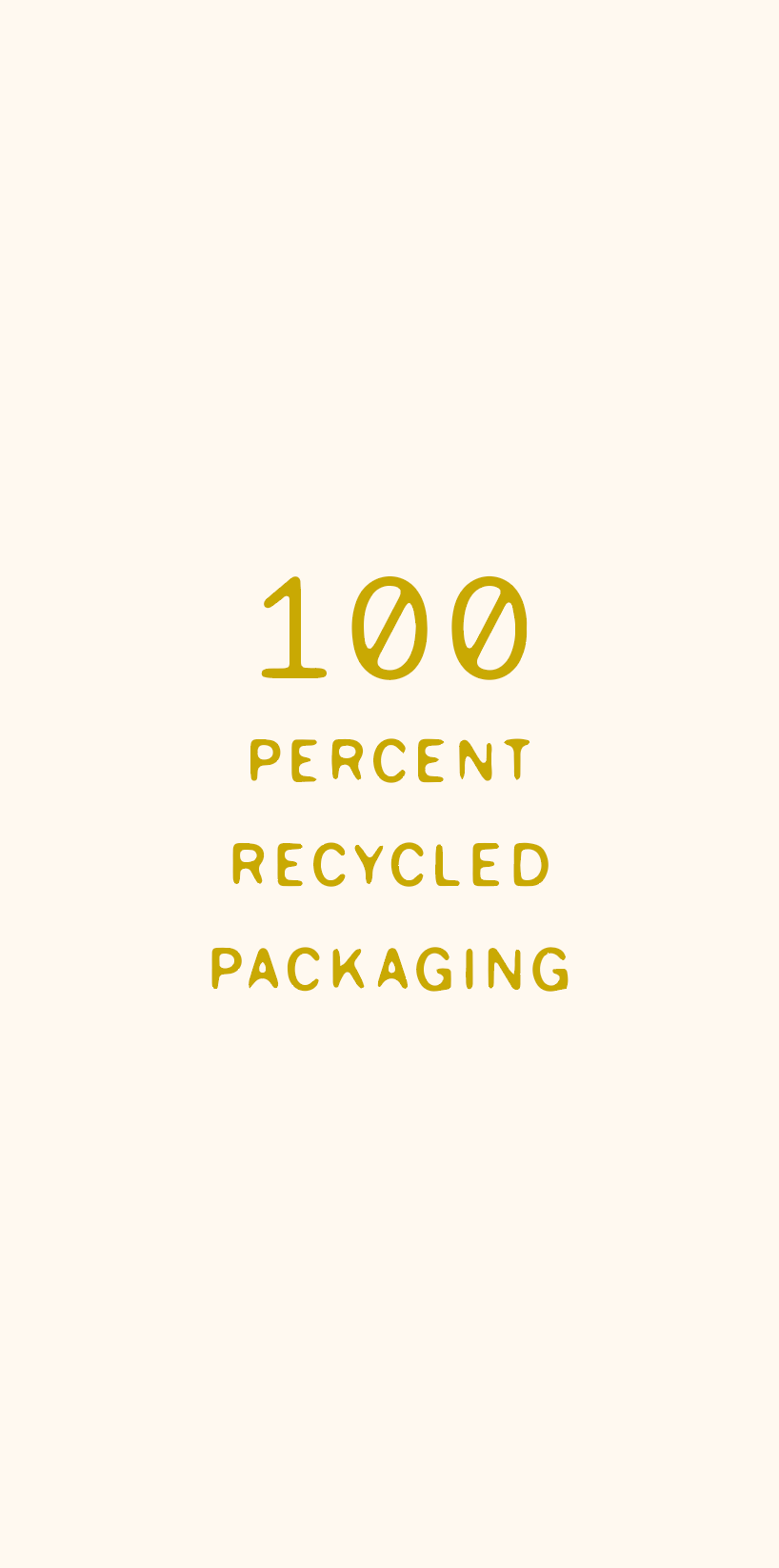
Design captivating, nature-inspired packaging for Stone Road Farms, a cannabis brand, that reflects their mystical tone and appeals to cannabis enthusiasts seeking harmony with nature. The design should feature whimsical imagery, a nature-driven color palette, and sustainable materials for an immersive unboxing experience.
The Brand
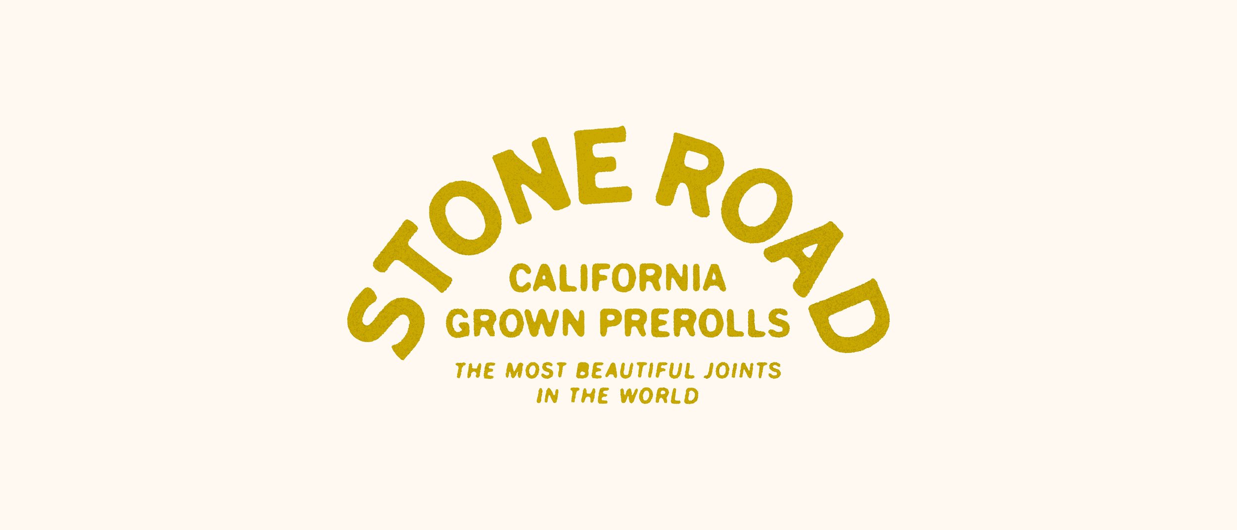
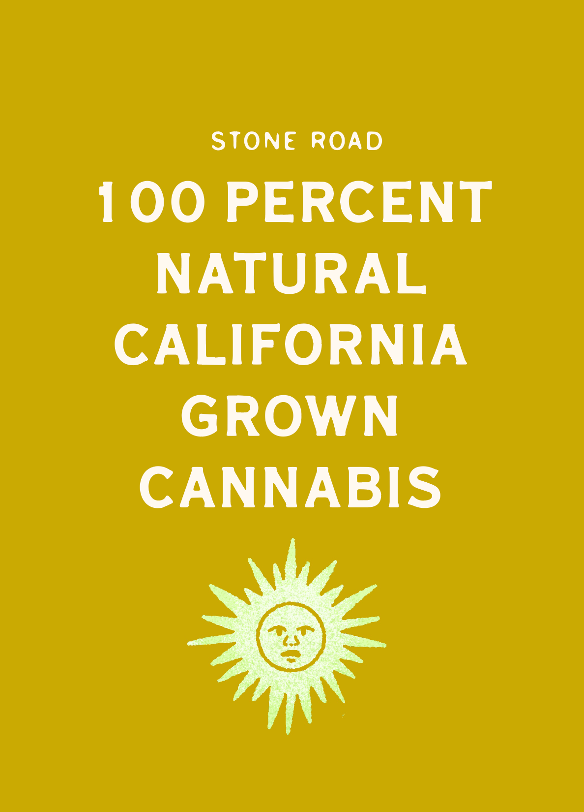
"The Most Beautiful Joints in the World"
Stone Road Farms is a sanctuary where cannabis is cultivated with love and care. Their organic strains offer a journey of discovery, uniting people through shared experiences. With eco-friendly packaging and a focus on community, the brand creates a welcoming space where cannabis fosters joy, unity, and inspiration.